Typographic Logos: 10 Rules for Success
When crafted with care, typographic logos have the potential to be elegant, efficient and sometimes even iconic pieces of design.
Restricting yourself to InDesign (with a workspace orientated towards text manipulation and layout) can provide excellent discipline for logo design and in turn lead to high-impact results.
We’ll show you five different brands that have skillfully utilised typography in their logo designs. Along the way we’ll pick out 10 valuable lessons, all of which can be applied using InDesign.
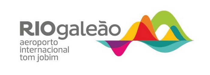
Rio Galeão Airport, Brazil
This modern logo for Rio Galeão airport plays on the famous mountainous landscape of Rio. The design combines colourful abstract illustration with bold grey text. Design by Ana Couto.
What can we learn from this design?
Lesson 1:
When combining a graphic with text, choose a font that matches the character of the illustration. Here, the playful curves of the Pluto font family echoes the style of the colourful waves. Mixing up different weights, Bold, Semi-Bold and Regular, of the same typeface is a simple way to create a hierarchy.
Lesson 2:
Think about structure. The left alignment of the lines of text forms a hard edge that holds the composition together. The edge maintains just enough order in an otherwise fluid design.
Absolut.
At the beginning of 2014 Swedish vodka house Absolut unveiled this refined version of their logo. The single line of extra bold type set in all caps encapsulates the no-fuss purity and iconic status of their product.
What can we learn from this design?
Lesson 3:
A row of tight, condensed capitals can create a powerful block-like composition. The uniform height of the characters combined with tight kerning gives the word a graphic feel.
Lesson 4:
Creative use of punctuation can lend personality to your design. Here the full stop further adds to the statement made by the heavy type.
Cardiff Metropolitan University
The logo of the prestigious Cardiff Metropolitan University gracefully incorporates two different languages in a stylish, custom-made serif typeface.
What can we learn from this design?
Lesson 5:
Small details can make a big difference. Here a thin and precisely placed line helps to impose order in a logo that combines multiple elements.
Lesson 6:
Repetition can add rhythm. In this design, highlighting the word Cardiff in both English and Welsh adds symmetry to the design, holding the composition together.
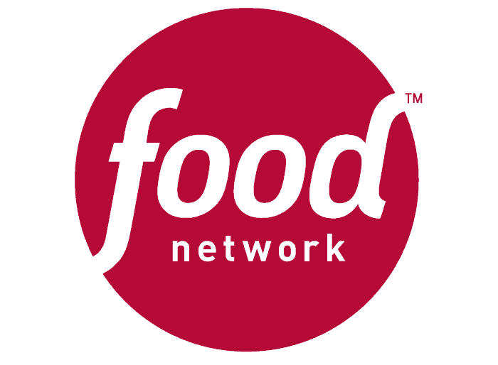
Food Network
The original food television channel’s logo, design by Troika.
What can we learn from this design?
Lesson 7:
Does the logo work at small-scale? Most logos need to be just as effective (and legible) at thumbnail size. Here the dramatic hierarchy of words prioritises the legibility of the word food when the logo is reproduced at a smaller size. The circle behind the text also increases visibility against any complex background.
Lesson 8:
Simple shapes can be an effective way of transforming text into something that looks more like a branded icon. A note of caution – using a shape just for the sake of it can look clumsy; here the tail of the f and the stem of the d are neatly framed by the circle.
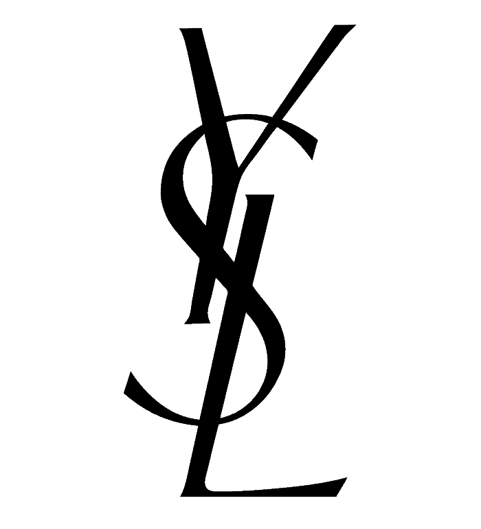
Yves Saint Laurent
The iconic logo for Yves Saint Laurent was created by Cassandre, a Ukranian-French commercial artist and typeface designer.
Finally, what can we learn from this classic logo design?
(To be attempted by brave logo designers only…)
Lesson 9:
Break the rules. In the fashion industry, Cassandre’s design broke away from the norm of modern serifs (think Calvin Klein, Armani, Vogue) and uppercase Grotesques (such as Chanel, Hugo Boss, D&G), the result is truly outstanding and unique.
Lesson 10:
Treating each letter as a separate object can open the door to creativity. Be warned though, placing letters this way is much easier to get wrong than to get right… the harmony and balance achieved in the YSL logo is nothing short of typographic genius!


